
Ever wonder how much energy your state produces? Check out our interactive map to learn the answer.
November 10, 2014
Here at the Energy Department, we take energy data and try to make it easily digestible for Americans everywhere. We’ve looked into how much you spend on energy and how much energy you consume, and now we’re back with a map showing how much energy each state produces. Let’s take a look.
How Much Energy Does Your State Produce?
Our new map shows you not just which state produces the most energy, but also what kinds of energy are produced in each state. The size of each circle represents the volume of the energy produced in that state. As a frame of reference, 1 trillion Btu is equal to about 51,000 tons of coal. If you want to learn more about understanding energy volume comparisons, check out this graphic.
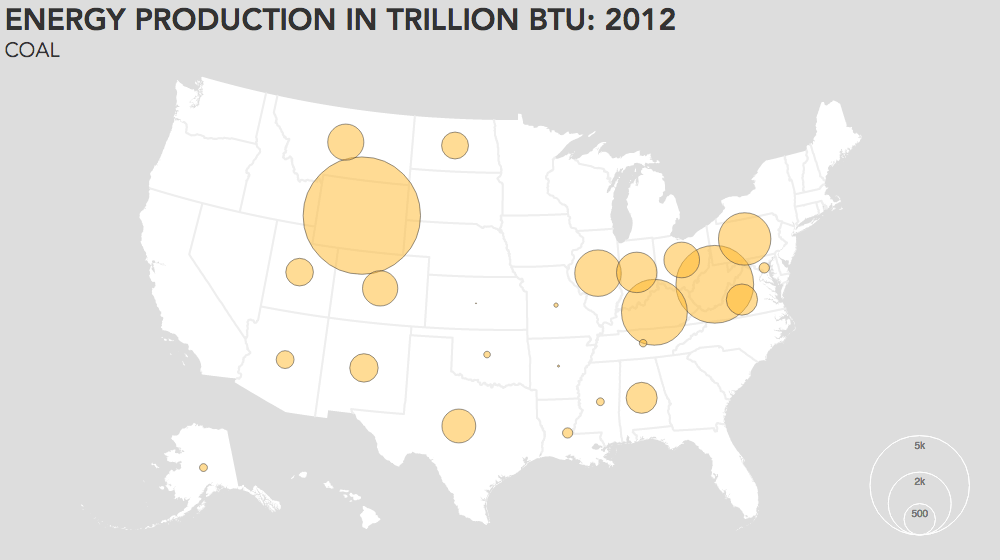
By clicking on each state, you can see a pie chart of each state’s energy production, between several types of fossil fuels (crude oil, coal, natural gas), nuclear power, biofuels and other types of renewable energy. Unfortunately, our data doesn’t currently allow us to break down “other renewable energy” any further, but we can assume that to include hydropower, solar, wind and geothermal power. We have broken out each type of energy into its own map, showing the regional variation of each energy industry, which you can see by clicking on this GIF.
Immediately, you will notice that fossil fuels (crude, natural gas and coal) make up the lion’s share of the energy that the U.S. produces. In fact, the top five energy-producing states overall (Texas, Wyoming, Pennsylvania, Louisiana and West Virginia) are also the top five fossil energy-producing states. The combined fossil energy produced by these five states combined accounts for more than 42 percent of the total energy produced in the U.S. each year.
By comparison, the bottom five energy-producing states (Rhode Island, Delaware, Hawaii, Nevada and New Hampshire, excluding Washington, D.C.) are responsible for producing only 0.2 percent of the nation’s energy, while they consume about 2 percent of the nation’s energy -- a 10-fold difference in volume.
Biofuels are biggest in the Midwest, particularly in Iowa, Nebraska, South Dakota and Illinois. This is predictable, as biofuels are produced through agricultural products like corn, which is the staple crop throughout that area.
Aside from biofuels, other renewable energy sources are produced in every state and Washington, D.C. Hydroelectric power makes up well over 50 percent of these resources in the United States. States like Washington and Oregon lead the way in hydroelectric power and recent gains in the wind industry can be seen in Texas and Oklahoma. There is an exciting opportunity for solar, wind and geothermal energy sources to become an increasingly larger part of our country’s energy landscape.
Looking at the map, it is clear that energy production is not tied to population, nor to energy consumption. Below we have a map that shows total state-by-state energy consumption in 2012. Energy consumption seems to be clearly connected to population, but energy production is tied more directly to the location of raw materials.
[[{"type":"media","view_mode":"media_energy_gov_wysiwyg_fullwidth","fid":"864081","field_deltas":{},"link_text":null,"attributes":{"alt":"consumption.png","height":560,"width":1000,"class":"media-image caption media-element file-media-energy-gov-wysiwyg-fullwidth","data-delta":"1"},"fields":{}}]]
As a result, some states have a net surplus of energy while others have a net deficit of energy. The states that have a net surplus of energy production in turn export their surplus to states with a net deficit in energy. Below you can see in orange which states are net producers of energy, and which states, in blue, are net consumers of energy.
[[{"type":"media","view_mode":"media_energy_gov_wysiwyg_fullwidth","fid":"864091","field_deltas":{},"link_text":null,"attributes":{"alt":"net.png","height":560,"width":1000,"class":"media-image caption media-element file-media-energy-gov-wysiwyg-fullwidth","data-delta":"2"},"fields":{}}]]
We see that states with a high production of fossil fuels tend to be the states that are net producers of energy. Additionally, states with high population like California, New York, and Florida seem to tend to be energy importing, with the exceptions of energy giants like Pennsylvania, and Texas.
Explore the interactive map at the top of the page and see what other trends you find. In the coming weeks, we will be exploring how energy production in the United States has grown and fluctuated over the last few years. (Hint it’s grown, a lot.) Stay tuned!
More Energy Maps
Interested in learning more about national energy trends? Learn how much you spend on energy and how much energy you consume.
